
A few tricks with layer masks
Higher dynamic range than your eyes can handle
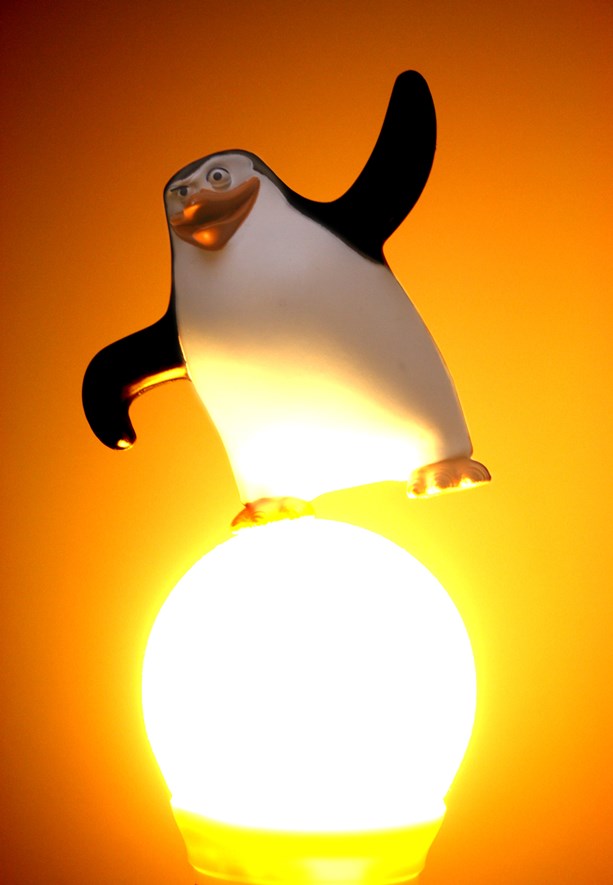
Theme of this week was "Lit", and my submission is shown to the left. I simply put the plastic penguin on top of the light bulb and shot it using fill flash. At first, I was not particularly satisfied with the results, but after some playing around with the colors in GIMP using layer masks, it looked much more appealing. Read on for some tips on how to use layer masks to make dark areas brighter, and bright areas darker - a sort of HDR, you could say.
Start super-short tutorial!
I use GIMP for this, but the same principle can be used in most image editing programs, including Photoshop. I also use a JPEG. You can get better results using RAW format.
Tip: Also check out my other, more detailed tutorial on layer masks and the levels tool.
Let's start with the original image.
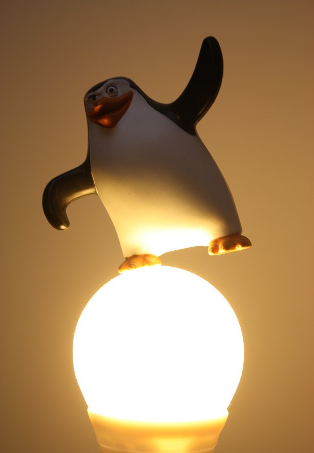
Duplicate the layer and work with the copy (right-click on layer, select Duplicate). By using the Levels tool, we can make the image darker and bring out some of the warmth from the light.
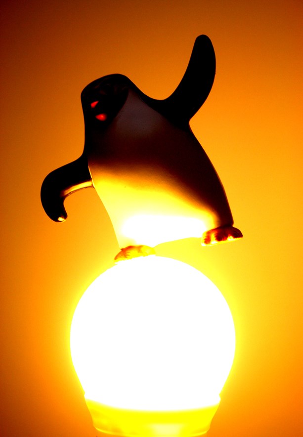
Make another copy of the original layer and move it to the top. Use the Levels tool again, but make the image brighter instead, so that the penguin looks right.
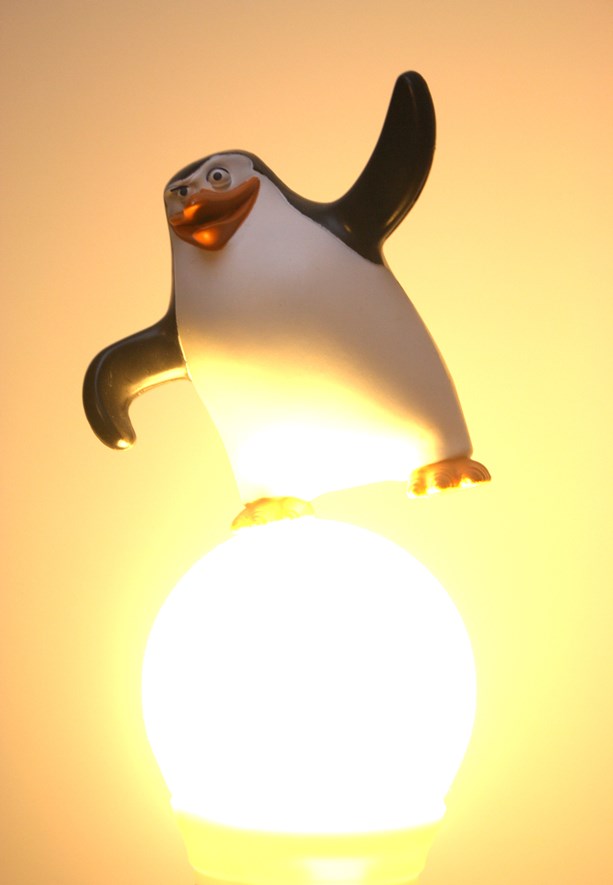
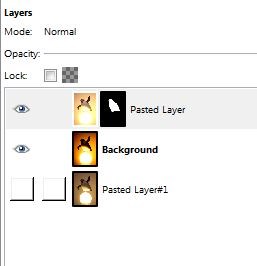
To remedy this, add a layer mask to the top layer (ie. the penguin layer). When asked, select to create it with Full Transparency.
After clicking ok, only the layer behind, with the dark penguin will be visible. But fear not! Paint with a white brush (a fuzzy, big one is usually good) and the brighter penguin shines through.
0 Comments
Subscribe to new comments by RSS